Hello and welcome. Today, Dr. TALM will be presenting for your consideration his latest research into the deep depths of LEGO color theory and the 5 best LEGO color combinations.
As we all know, color affects every aspect of our day-to-day life. As such, gaining a fuller understanding of the value that color has upon LEGO building is of utmost importance.
Without further ado: Dr. TALM.
*clap clap clippity clap*

I. TALM1700 Intro to Color Theory.
Before we get into the messy work of mixing and matching colors, it may first be helpful to understand some basic principles.
So let’s define our terms!
- Hue: Describes the color of visible light which is reflected back into our oculus uterque (eyes). If we wish to speak about a certain color, we rely on its identified name, ie. red, blue, green, etc.
- Saturation: Indicates how intense a hue is. Vibrant colors have a high saturation, and as a color approaches grey, it is said to have a low saturation. Not to be confused with value, which refers to the lightness/darkness of a color. Quite simple!
- Chroma or Luminance: Another descriptive indicator, now combining both hue and saturation. Chroma refers to the extent to which a color departs from a neutral color of the same value. A low chroma is said to be “weak”, while a high chroma is “strong”… in other words, “highly saturated”, or “absolutely not grey”.
- Tints, tones, shades: respectively, a color mixed with white, a color mixed with black, a color mixed with grey. These buggers are known to complicate things!
So, now that we have a proper working vocabulary, let’s move on to how we can apply it. Don’t worry, folks, LEGO is not far away!
II. Methodical Methodology on Method.
In order to be successful in combining colors, gaining a proper knowledge of how colors interact and intermingle is important. In doing so, the ability to both discern “color harmonies” and to communicate with them will become an asset.
Let’s become acquainted with the color wheel:
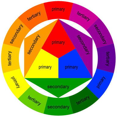
The color wheel consists of the three primary colors (red, blue, yellow), three secondary colors (primary colors mixed together to create: orange, purple, green) and six tertiary colors (created from different mixture ratios of primary and secondary colors: such as yellow-orange or blue-green).
Now let’s see some actionable examples!
Divide the color wheel from red to yellow hues (the warm half), and from violet to green hues (the cool half). A “color scheme” is created when colors are found to work well together.
Complementary colors are located opposite from each other on the color wheel. These pairings provide popping contrast, but a good rule of thumb is to avoid overusing such combinations.
Analogous colors are just that; these hues peacefully reside right next to each other on the color wheel. Pairing up these colors is a fine way to create accents, which involves allowing one of the pair to yield to a more dominant color.
Diadic and Triadic colors are evenly spaced around the color wheel, occurring every two or three swatches, respectively. This color scheme can be used to create dynamic combinations that also retain a key element of harmony.

III. A Literature on LEGO’s Colourful Past.
With all that established, let’s turn now to the manner in which LEGO has used color in the past! *applause*
Back when LEGO was still new on the market, the color selection was much more limited. In the 1960s and prior, colors such as grey, black, white, tan, yellow, orange, red, green, and blue (along with some transparent elements) were all that was available.
This limited palette acted as a creative constraint upon what builders and LEGO set designers could do – in realism, that is. Just how many different kinds of sets – buildings, vehicles, spacecraft – can we make with these options? That was the question builders of the day didn’t even have to spend time thinking about. They just played around! No poofy color theory required.
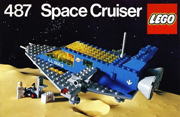
As time progressed, LEGO of course added many more colors with varied values and luminance. Colors began to be used to tell a story.
Colors with dark values were coupled with searing highlights in order to indicate “the bad guys”, while uniformly brighter colors were granted to “the good guys”. Additionally, color codes became strategically employed to highlight the product’s target demographic – low chroma, low saturation hues (ie. “pastels”) typically filled girl-focused sets. Basic primary colors dominated the sets made for toddlers and juniors.

When LEGO introduced colors branching out from the tertiary spectrum (sand green, sand blue, bluish grey, dark tan, teal etc.), realism became more possible for (and idealized by) set designers – especially as big ticket LEGO sets with hundreds upon hundreds of pieces became more commonplace.
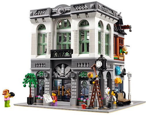
Again, the colors help tell a story.
Sets in the Modular Buildings and Architecture lineup, which have now been lumped under the “Adults Welcome” (oh that phrase!) marketing, typically include dominantly subdued color schemes. Because, you know, adults want more realistic stuff. Stuff to use as decor, and as a statement.
On the other hand, regardless if one “loves ’em” or “loves to hate ’em”, current themes such as LEGO Friends, the retired LEGO Elves, as well as LEGO Dots have indisputably utilized very vibrant, dynamic and aesthetically pleasing color schemes. Though targeted at girls, both of the aforementioned themes have used color to tell a rather different story than what was typically expected of girl toys in the past.
As an Amazon Associate I earn from qualifying purchases.
Want Some Visuals?
If you want to see some interesting color combinations in action, check out the LEGO Friends range of sets. Aesthetically and play-wise, Friends has been one of LEGO’s stronger themes in recent years. We need more of this kind of stuff in the standard minifigure LEGO sets!
LEGO Friends Sets on Amazon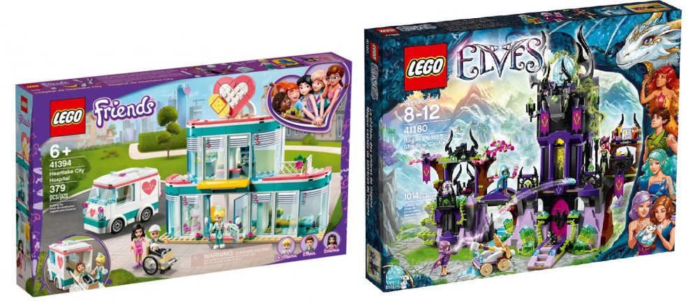
IV. Presenting a Presentation of Recommendations.
So now here we are! Will you trust the picks of a LEGO Maniac? Following below are 5 of the best color combinations to build with.
Color Scheme 1 “Balance of Energy”: Teal & Yellow/Yellow-Orange

Choose which color will dominate in this diadic palette, but be prepared for a burst of energy either way. This is a great combination to play with contrast and highlights in your LEGO build.
Color Scheme 2 “Natural Touch”: Pink/Coral & Green & Sand Green

A triadic palette of soft tints and shades. This combination can be interpreted as organic, natural, or feminine. A great opportunity to make a LEGO creation with a warm or luxurious feeling. Or perhaps go tropical by adding a tiny flash of yellow, an accent of teal to this base of green! Note: coral LEGO elements are still fairly new, and only a limited selection of parts in this color currently exists.
Color Scheme 3 “Bold and Pensive”: Pink & Tan/Orange & Violet

Create a LEGO model with a celestial brilliance or the mood of an epic sunset! This can be a stunning combination to use, and if you opt to accentuate the tan, you may achieve a vintage sepia look. Many classic, legendary, and nostalgic LEGO sets incorporate these colors into their atmosphere.
Color Scheme 4 “Earth Tones”: Black & Tan & Dark Grey

If you want to evoke elegance, this palette of tints and tones is for you. Depending on the balance and accents, this combination of warm and cool hues can imbue a LEGO creation with an appearance of stability and timelessness.
Color Scheme 5 “Sign of Life”: Tan & Black & Teal/Light Blue

A symbolically natural, organic, masculine combination. With the more subdued hues acting as a base, the teal/light blue highlights boldly and vividly claims the forefront.
V. Implications & Conclusions, Submitted for Your Consideration.
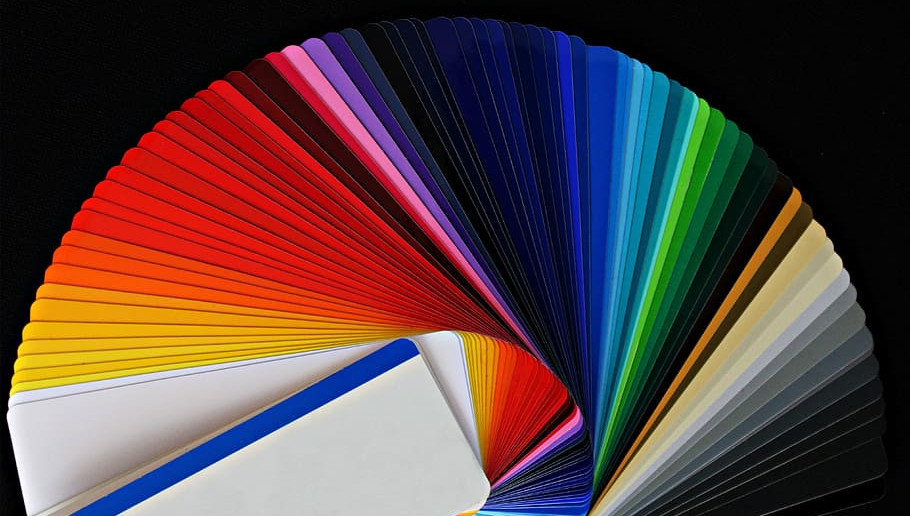
When is comes down to it, don’t feel intimidated by all the options LEGO has available today!
Work your way around the color wheel and see what types of pairings and triads that you gravitate toward. Expand your color palette to liven up your LEGO building; even the simple incorporation of a few bright colors you have not yet used can do the trick.
And of course, use basic primary colors – there is nothing at all wrong with some simplicity.
Impose your own limitations, or work within an established aesthetic! I find it easy to link an aesthetic with specific LEGO themes, such as Classic Castle, Space, Aquazone, Belville/Friends, etc. Study them, and study current official sets.

In regard to your own collection of LEGO pieces, try to have a decent quantity of basic, neutral colors like grays, white, tans, browns and black. And if you want to purchase LEGO sets as a builder rather than a collector, be sure to focus on the pieces – quantity and color – that are included; and estimate how much you want for your project. Prioritize those “part sourcing” LEGO set purchases accordingly.
…So! I’m curious what LEGO color combinations are most appealing to you? Can they be found in any official LEGO sets today?
Want to 1-Up Your Building?
If you’re looking for techniques on color theory, balance, and unique part usage, check out The Inner Workings of a LEGO Mind, by master builder Steven James Erickson. And if you want more recommendations for LEGO inspirational building, check out the blog post on the subject!

Great article! It’s funny because I was about to do an art piece and I was brainstorming on what color palette I should use. I always get stuck trying to pick colors, but your article actually inspired me to try one of your suggestions. I know your suggestions are for Legos, which is super cool and I am so glad I came across your site, but the color theory has implications in so many areas of our lives. I actually use Legos to make molds for some of my resin art so I have some lying around. I picked a few that matched your color palette suggestions so I could see my palette in front of me. Great suggestions. Also, it was nice to have a little refresher on color theory. Thanks!
This is awesome to hear! I’m curious to see your resin art. 🙂
It can definitely be easy to get stuck on the color step of any ground-up creative project. With sculptural art, or LEGO (or like you said – most areas of our lives), color is unavoidable and plays a big role in so many aspects of an experience. It’s fun to experiment with color, or even to get into color theory, but endless experimentation is not always ideal! Glad this post was of assistance to you.
I love lego ever since I was a little kid. I hear there is a new batman lego out now. Or at least I think there is. And the insight into colour matching is great. As an Amateur artist who studied art at university I found it a great reminder and never really thought about its uses in lego.I know there is a lot of new lego out, and I have even heard there is lego art, is this true? If it is I will have to investigate further.
Thanks
Steve
Color selection can be a very fun step in the artmaking process, certainly.
And: yes and yes! LEGO Batman sets are quite prolific at the moment – there are expensive collector’s sets like the 76139 DC Batman 1989 Batmobile, the 1989 Batwing, and then there are also smaller playsets and display pieces too.
You also might be interested in checking out my post on the subject of LEGO art (Best LEGO Fan Art Merchants) – there are both unofficial fan creations as well as official LEGO sets now that function as wall art and décor.